Really?
Really?
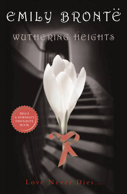
Well, yes, of course, because whenever I think of the raging feral love between Cathy and Heathcliff, I always think of a soft white tulip climbing a stately staircase on red ribbon legs.
I mean, don’t you?

Really?
Really?
Well, yes, of course, because whenever I think of the raging feral love between Cathy and Heathcliff, I always think of a soft white tulip climbing a stately staircase on red ribbon legs.
I mean, don’t you?
Hey, they got the umlaut over the “e” right; you want them to actually know what the book is about?!
And how ’bout the caption: “Love Never Dies…” Makes it sound like a modern romance novel.
Capitalizing on the Twilight books – that cover looks exactly like the style of the books in that series.
Wait a minute- does it say “Bella and Edward’s Favorite Book” in that little red seal?
It does. OMG.
I’m speechless.
It is their favorite book! I bet tweens all over the place are gonna run out and read Wuthering Heights as well as Romeo and Juliet – because they are mentioned so strongly in the Twilight series.
Look at the tween-style font!!
I am glad my copy of the book doesn’t look like that – I like my classic version – but if it makes young kids pick it up and not be intimidated by it, I’m all for it.
There really ought to be a comic strip version of this book starring Cathy by Cathy Guiseweit and Geo. Gately’s Heathcliff.
They came from two different worlds…
I am concerned about the thin-ness of the ribbon legs being able to actually support that giant ghost-white tulip as it perambulates up the stairs.
Sal — You’re right! It says that. How did I not notice THAT??
sheila — It does look like those covers. I should have mentioned, this is apparently a cover for a kids’ version of the book but I don’t know that that means. Do they just change the cover? Or is it an adaptation where Cathy lives and Joseph’s dialect is simple to understand??
And, believe it or not, I had exactly the same thought: Oh no! The tulip’s not gonna make it! Its ribbon legs are too compromised and atrophied!
NF — Hahahahahaha.
I have a feeling Cathy herself would scoff at the cover. She wasn’t really a romantic type.
But hey, if some tween picks up the book because an atrophied tulip staggering up the staircase reminds her of the passionate unconsummated love of Bella and Edward – then I say we all win.
sheila — /But hey, if some tween picks up the book because an atrophied tulip staggering up the staircase reminds her of the passionate unconsummated love of Bella and Edward – then I say we all win./
I agree.
Until they go “Uhm, so where are the vampires??”
I read Dickens’ Oliver Twist at age 10, 11 – in its entirety – because I was in love with Jack Wild as the Artful Dodger in the movie musical.
I was completely baffled at some of the omissions in the film – and how some of it was different from the movie – I was TOTALLY discombobbled at first – why isn’t Mr. Bumble breaking into song here? (etc.) – but then I got into it.
Stephenie Meyer really does “get” Wuthering Heights – in the same way that all feral adolescent girls “get” that book – and her writing on it in Twilight is compelling enough that it would make me want to read it as a kid. Not to mention the Romeo and Juliet section of the Twilight series – which I found very interesting, because she (Stephanie Meyer) focuses on PARIS – not Romeo or Juliet. I loved that – it wasn’t the most obvious choice – but she had a lot of thoughts on the role of Paris, etc. – and I imagine, again, that hungry thirsty vampire-needy tweens will flock to these books just to feel closer to their fictional loves.
I mean, half of my movie-watching and book-reading to this day takes this approach!!
Although I am overly sensitive to ikky book covers and will pay MORE money to avoid atrophied tulips at all costs.
Wow. I’m surprised they didn’t use the Zephyr font just to make a bigger connection.
But I agree. Unsuspecting tweens should read the book. They probably did something to deserve it–like liking Jacob over Edward.
sheila, I do like how she focused on Paris. That was pretty cool.
Yup, YA librarians can tell you that kids really do judge books by their covers. A picture of the moors would not sell this title, but this cover will do nicely.
I am very impressed with the group’s analysis! (ITA about the Paris thing; one of several reasons “New Moon” is my favorite, although I often get the impression I am in the minority.)
I’m hoping because the word is spelled “favourite” on this particular edition’s cover that it will never, ever be found in my bookstore. Or my library.
I read W.H. out of curiosity one summer in college and. . . ugh. It ranks right up there on the misery scale with “Ethan Frome.”