
Here’s an interesting tidbit I discovered that I feel I must share:
You know how everyone always gives newborn boys things that are blue and newborn girls things that are pink? Well, turns out that up until about 1936, pink was the color for boys and blue was the color for girls. It seems so backwards to us now, I suppose, but the rationale behind that was that blue was considered the more delicate color and pink was considered the more robust color, coming as it did from red. See how that works, fellas?
Then, in 1936, Italian fashion designer Elsa Schiaparelli created a perfume called “Shocking,” which caused quite a stir not so much for the fragrance as for the way it was packaged: a box of shocking pink — a color invented by Schiaparelli — containing a curvy glass torso bottle, modeled after one of Schiaparelli’s clients, Mae West.
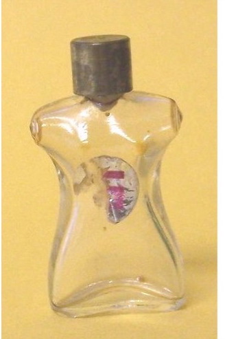
Luscious, no?
So, you see, after such blatant hubba-bubba-ness, the color pink became associated with women and men everywhere cried copious, robust tears.
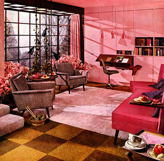
But here, fellas …. feel better … I’ve fixed up a room for you …. have a seat …. a manly muscular pink seat …..
I don’t think I ever would have known that if not for you. 🙂
Yay! I have a purpose in life! Imparting useless knowledge to people who didn’t know they needed it!
I like that room. It’s very pink. I can see bringing students in there when they’re upset and having them calm down.
there are psychological studies that suggest pink is a “tranquilizing” color. That’s why some drunk tanks are painted pink, and why one (High school, I think) coach (in)famously had the visiting team’s locker room painted pink.
If I had the time and energy, I’d remove the dark-green-with-cabbage-roses wallpaper in my bedroom (which was applied over paneling, which suggests to me the plaster walls are in bad shape) and either paint the walls pink, or put up a beaded-board paneling and paint it pink. (Yes, I live alone).
ricki — That sounds pretty; I think you should do it.
My youngest brother looks so handsome in pink. However, he feels that to wear the colour would cast doubt on his masculinity – perhaps this will persuade him… I’ll definately have to try. 🙂
Thanks for the picture, Tracey. It reinforces my hatred of 70’s decor.
hate to disillusion NF- the ’70’s were indeed the nadir of all things decorative- but that picture is clearly from the 1950’s. The cork floor, the chairs, the pole lamps with ivy growing up them, the inset desk and bookshelves in the wall o’built-ins painted Pepto-Pink are all dead giveaways.
I want to know what’s happening here.
Who’s knitting with the basket of olive drab yarn with the gravity-defying needles? Is this before or after luncheon? Was there something wrong wtih the tomato surprise? Is that an ashtray in the coffee cup?
I need some answers here!
Well, I defer to you on this, Sal. I just seem to remember a lot of this stuff enduring into my own childhood, only a lot more purplish and orangey. Also, the rugs were four inches deeper. You’d only find the cat by turning on the vacuum and waiting for her to flee.
“I shall decorate this room in every shade of cack.”