
I am obsessed with a book cover. I hate myself.
But it’s true.
Why am I bothered by this? It’s not like I have nothing else to consume my thoughts like, oh, healthcare reform and the ongoing fallout from the Maybe Church debacle and why the toilet isn’t flushing properly and what is up with that one chick’s eyebrows on America’s Next Top Model. This is big stuff. Important stuff.
I am, mentally, VERY busy.
But, nevertheless, squeezed in between those pressing thoughts is the nagging thought of how very much I dislike the cover on my copy of A Reliable Wife.
(Summary: A rich man with a past places an ad for “a reliable wife.” A woman with a past responds. Hijinx ensue.)
Here is my cover — the only one I see in bookstores now. It makes the book seem like a bodice-ripper, which it decidedly is NOT:
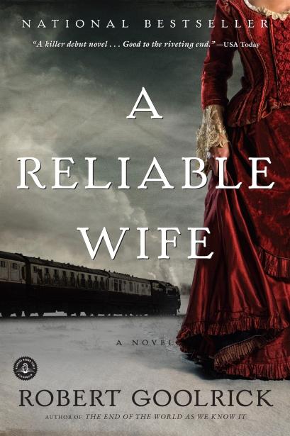
It’s the red dress, you see. It makes me nuts. The red of it, the sheen of it, the it of it. That I even have to refer to “it.” There is actually a scene at the beginning of the book where the “reliable wife” is on the train, steaming her way towards her new husband and she opens a window and flings all her fancy dresses out into the dark and the snow. She deliberately dresses down for this man. So it bothers me and it’s ridiculous that it bothers me, but it does. I mean, the red dress keeps me up at night. The stupid red dress. The book sits on the floor by the bed now and the red dress says, “Hahaha. I bug you.” And I say, “No, you don’t, shut up,” and I shove another book on top of it so I don’t see the red dress while it just laughs and laughs.
You know, it’s quite possible I have bigger problems than the stupid red dress.
But here are a couple of other covers I found online for this book. They must be available somewhere. I mean, someone somewhere is HAPPY with their cover of A Reliable Wife. Why can’t that be me?
Okay. This one is better. Not my favorite, but somewhat better:
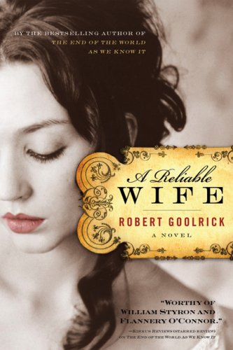
I like the old-fashioned banner, the lettering, the soft black and white, the non-Perfect Storm font, the utter lack of a red dress. Not spot on, but better, yes.
Here’s my favorite though:

I love the starkness. That feels right. And the old-fashioned kind of bookplate title. The little red bird has a context within the book and I like the dimensionality of that detail. The covers with the dress and even the woman imply too much or even mislead, but this one works for me. The spareness of it is SO right for atmosphere of the book. It’s pretty spot on for me. Yes. I want this cover.
So, okay, I’m a little overwrought about a stupid book cover, but there’s an underlying issue here for those of us who love books and that’s this, I think: We like the look of the book to FEEL like the book, don’t we? The cover needs to feel right, encapsulate the vibe, the atmosphere, the story found inside, and when it doesn’t, it’s just off. Wrong. Of course, you can’t know the rightness or wrongness of the cover until you read the book, but then, if you’re like me and the cover suddenly feels like a huge mismatch on a book you really liked, you become unattractively obsessed — as opposed to attractively obsessed, please understand the difference and tell me what it is — and NEED to scour the bookstores and the Internets until you find a version with a better, more fitting cover.
Because, well, you’re insane, is the problem.
Insanity is the problem, not book covers.
Insanity, Trace. Okay?
Oh man, this is awesome. One of my favorite topics! It’s amazing to me the difference in different editions of book covers – how some seem to be pandering – while others seem to nail the feeling of the book just right.
One of the best novels I read in recent years was a novel called Inglorious by Joanna Kavenna. I had heard spectacular things about this book – a first novel. I had passed by the book on the shelves, and it looked like typical light chick-lit, something that doesn’t interest me – but the reviews told a different story – that this was a searing examination of depression and paralysis – written in stark unforgettable prose. Hmmm. But this was the cover of the US edition: http://www.popmatters.com/pm/review/inglorious-by-joanna-kavenna/
(Again, with the red clothing and the headless woman!!!)
Finally – Inglorious was re-issued with a new cover – which may seem alienating to SOME readers (ie: the chick lit crowd) but spoke directly to me, someone who doesn’t like light fiction. Here is the re-issued cover:
http://us.macmillan.com/inglorious
A perfect representation of the fracturing of a mind under pressure. Old-fashioned, perhaps, it looks like a book cover from the 1960s – but that was part of the appeal of it.
It is obvious why the first cover was chosen – to have a broad appeal and make it seem like other books. But it backfired – turning off the very readership they needed. There was a lot of press at the time about that cover – how unhappy people were with it, the author, etc. – so re-releasing it with a new cover – so drastically different from the other one – was an awesome move, I thought.
What I am trying to say … is that I relate completely to your insanity.
Oh, and just to add: when I finally read Inglorious, I was almost insulted by how much that first cover completely mis-represented what the novel was.
I get it, I get that marketing is important – but I am also someone who needs to be marketed to – and it was amazing how much that first cover turned me off. I am so glad I finally read it, because it is a superb book.
Covers are VERY important!!
“We like the look of the book to feel like the book.”
YES, yes we do. This is why I cannot ever buy a Kindle. A person can’t read The Hammer of God or Anne of Green Gables on a big electronic…thing.
I completely get what you’re saying. Never heard of this book, though, possibly because I’m too uh…engrossed in (or, you know, shackled to,) Wheelock’s Latin, 6th edition. But it looks amazing. And I am building a fabulously indulgent reading list for the summer, so if it’s as amazing as it looks, you have to let me know, so I can read it.
I keep looking for an edition of Thomas a Kempis’ The Imitation of Christ that looks right, feels right, and is translated well. (capturing both the letter and the spirit of the original)
I like bookcovers like I like album art, but I find myself reading a lot more electronically than physical books these days. Unlike albums though, I still like to have books around. I like my bookshelves even if they aren’t quite as used as they used to be.
Sheila — Wow. SUCH a huge difference in those covers! (And what is with the headless woman theme? Is there something to that? Should I possibly feel oppressed?)
When I clicked on the link to the second one, I literally MISSED the cover. I was like, “How weird. Paint chip samples on this page.” But that’s the cover! I love it. I know nothing about this book, but THAT cover would draw me to it; the first one looks like total chick lit, you’re right. (Says the woman who read the book with the gloom and satin bodice-ripper cover.)
I’m really glad I read this book, but again, now that I have, the cover BUGS. Not right at all. I had a huge discussion about it with another lady at the bookstore who had read the book. Thank God she said, “The red dress — what is UP with that?”
My copy of Frankenstein is a Barnes and Noble classic. I bought it because it was cheap and I just don’t like that cover. I didn’t like it when I bought it, but again, the cheapness won me over. I don’t even know, exactly, WHAT I’d want a cover for that book to look like, but not the Barnes and Noble one. I need to find it and show you.
Katie — Yes! I definitely recommend A Reliable Wife. It’s unexpected. Hypnotic. I hear they’re making a movie, which I feel nervous about.
Tracey – I think sometimes gloom/doom/bodice/ripping is appropriate – but when it’s not, and you feel the book is being misrepresented – it’s a bit infuriating (especially if the cover is what turned you off in the first place). I am trying to think of another example …
The second book cover you post here makes it look almost like a made-for-TV movie or something – it’s very pretty, but it could almost be a movie poster, with the real image of a real woman there. The last one is quite beautiful and stark and mysterious – draws you in.
Here’s something I linked to last week – I think you’ll flip – it’s a funny analysis of the differences between UK and US editions of books, where the writer chooses which one he likes best:
http://www.themillions.com/2010/03/judging-books-by-their-covers-u-s-vs-u-k.html
I just love this stuff!! Even the covers that don’t really work for me, are interesting. Like: WHAT made you come up with THAT??
And I have no idea why, but most chick lit seems to feature headless women on the covers.
http://dovegreyreader.typepad.com/dovegreyreader_scribbles/headless-women/
Dissertations will be written about this in the future.
Tracey – when they make a movie you’ll get a whole new book cover to consider. I’m not typically a fan of books movie covers.
Tell me what A Reliable Wife is about. I demand it.
Cara — Hahahahahahahaha. No. You are part of a sex cabal. Go away.
sheila — Sorry! You went into moderation because of the links.
Oooh, I love the link to those covers! Thank you. So much fun to pick my favorites. (I was in agreement with the post author on nearly all, actually.) Love this stuff.
My sex cabal is awesome. AWESOME. And you’d be nothing without that sex cabal!
Cara — Yes, what would we do????
Tracey – yes, me too – I agreed with almost all of the opinions in that post.
I’ve been wanting to read this book. I read a great review on Powell’s website so, it’s on my list of “Must Read.” I had no idea, though, that there have been multiple covers. The red dress is haunting.
Kathi — But the red dress is all WRONG, I tell you!! It drives me crazy!
I’ll have to read it to understand. But, why do you think red is used on all of the covers? It’s not quite as bright on the middle cover – just her lips. But, the red is such a stark contrast to the backgrounds and coloring of all the covers.
Oh, you are so right. The third one is definitely the best fit for this book. Although I love the red dress on the first cover, this is the edition that I read and, you’re right, that dress is bothersome. The third cover addresses not only the starkness of the outer environment but the starkness of the inner. Throw in the little bird. Perfect.